Development of the PARIMATCH corporate website
View online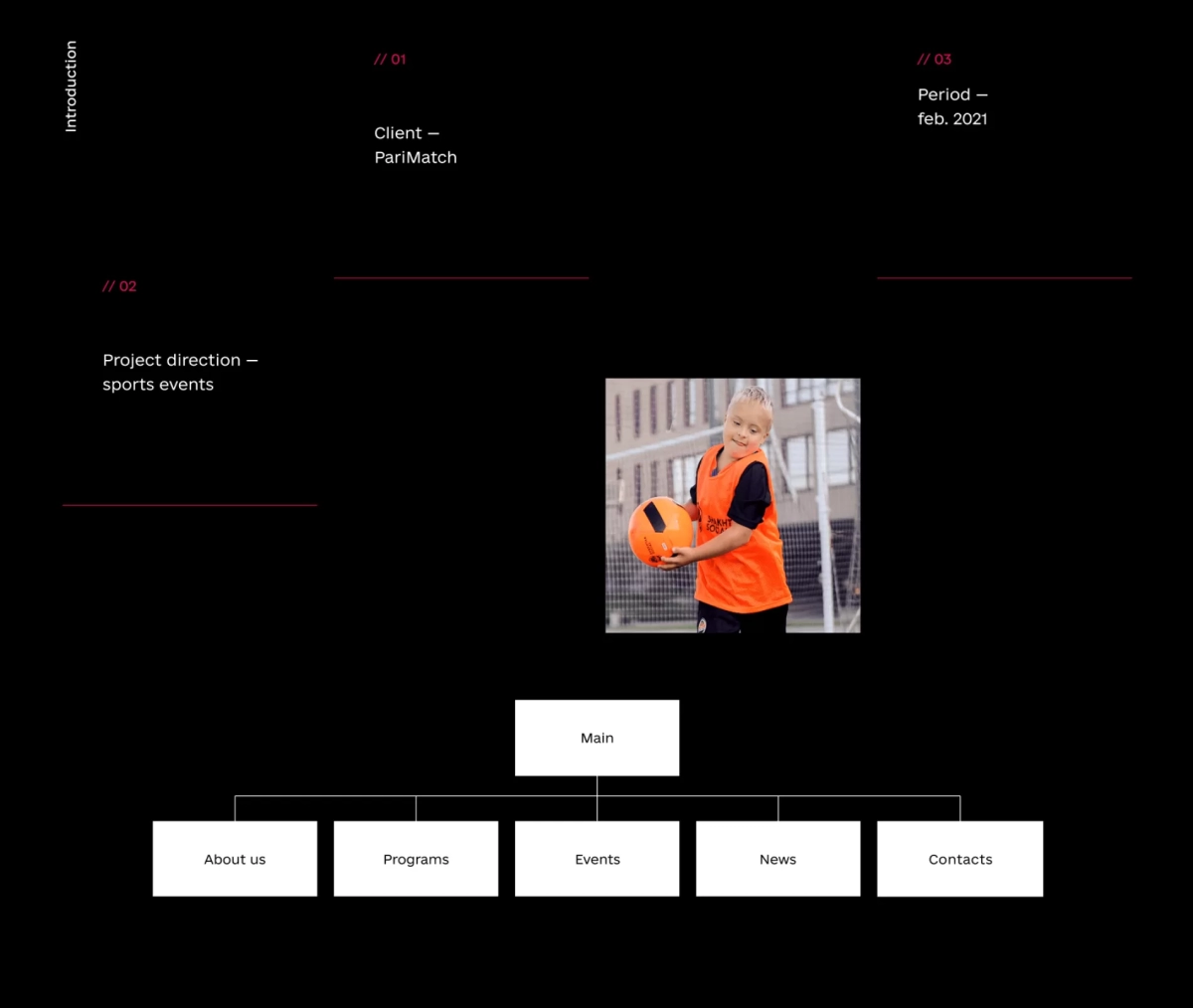
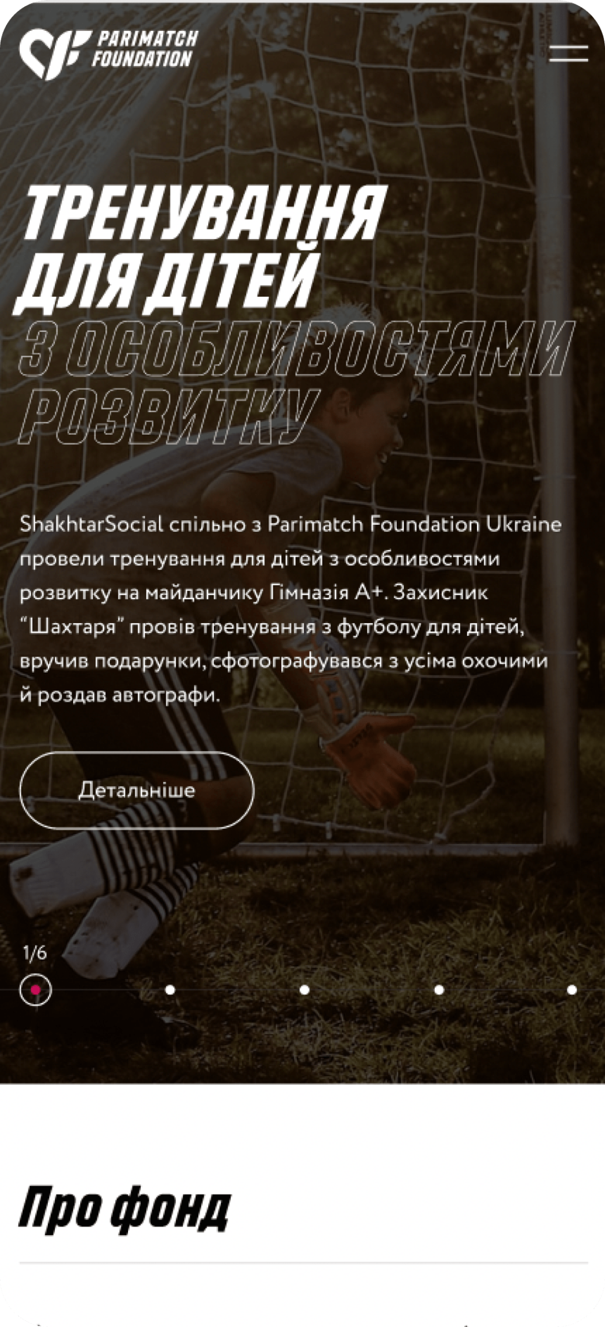
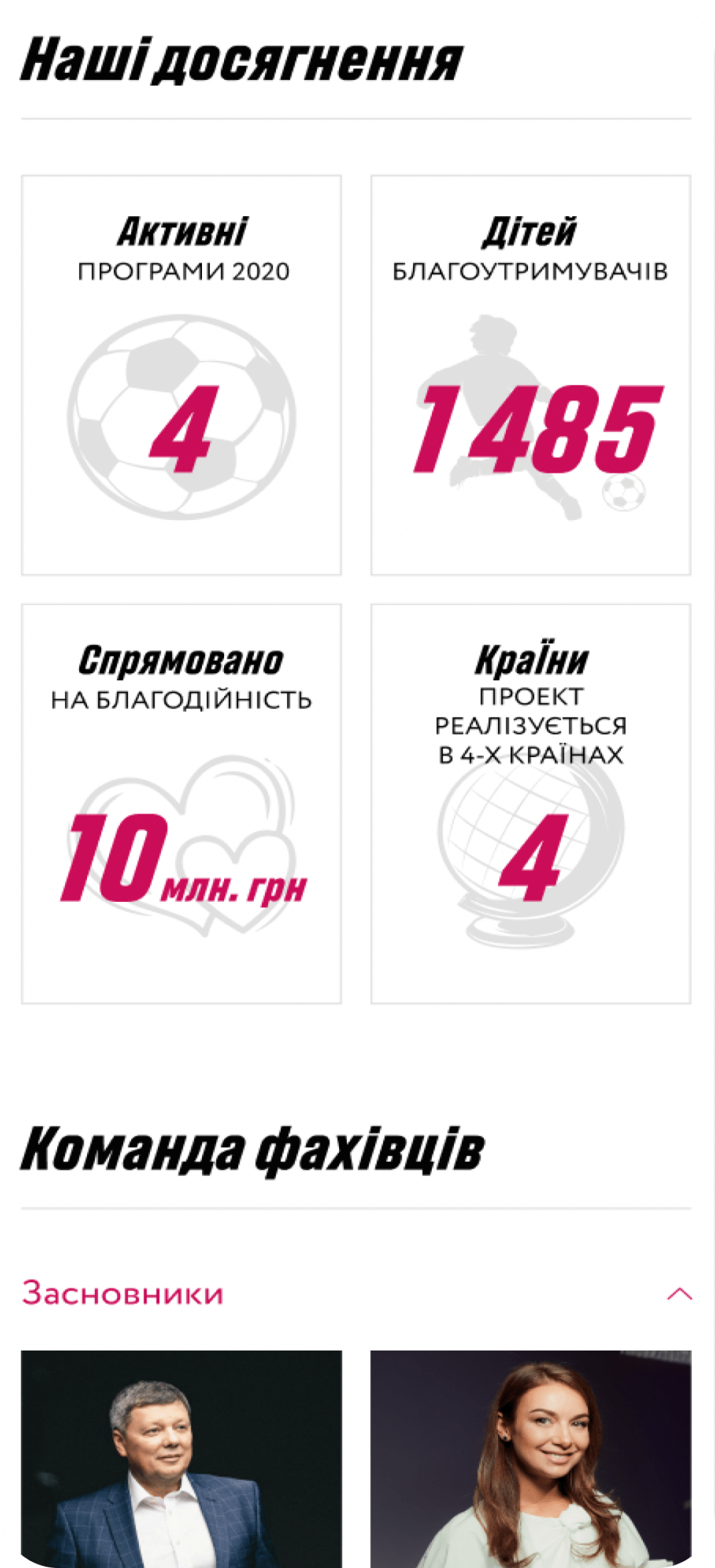
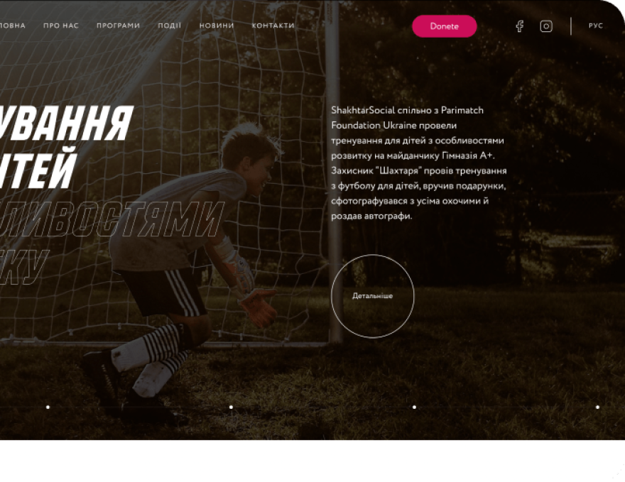
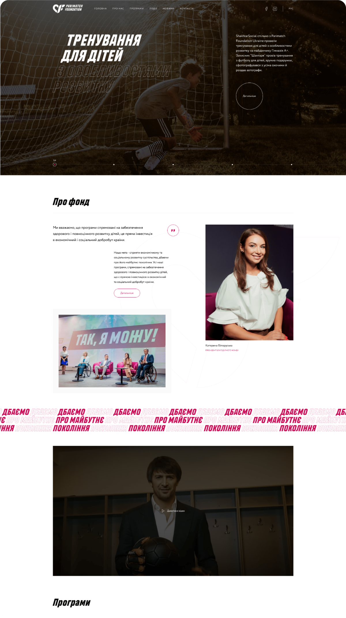
We have developed a unique, thoughtful main page that contains the most important blocks. A well-designed structure allows the user to immediately find the necessary information about the fund.
Modern and unobtrusive animation has been developed.
For sites of this topic, the main thing is a well-thought-out UX/UI, organization and dynamics.
There are interesting "hover" effects on all active elements.
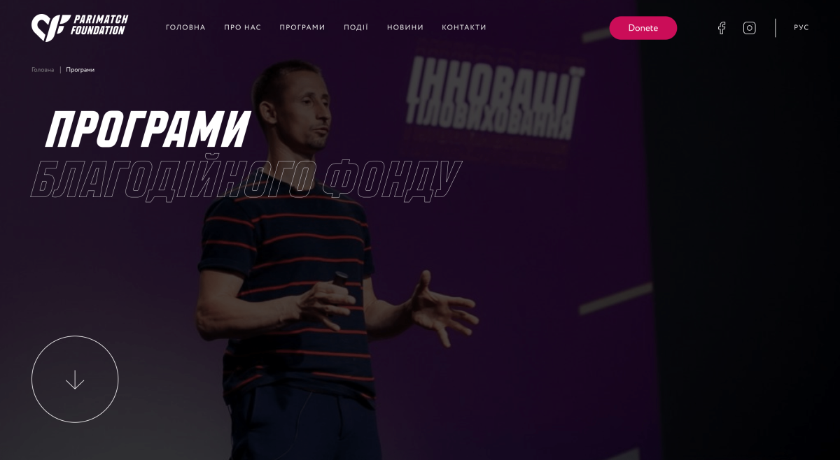
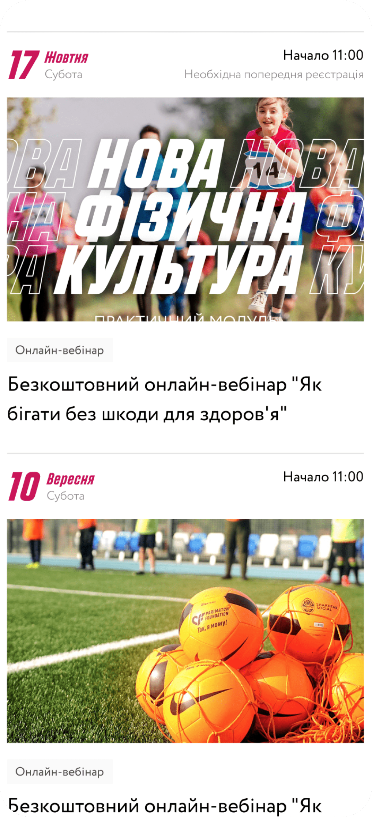
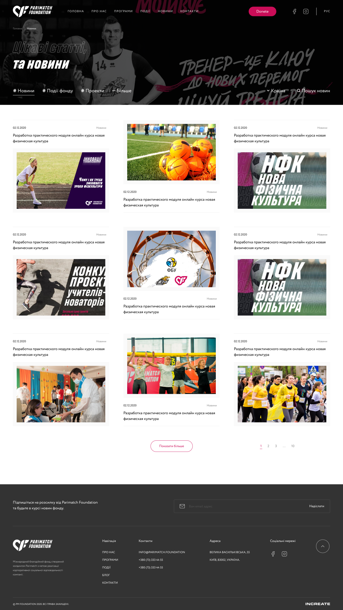
A unique UI/UX design of the section has been developed
"News".
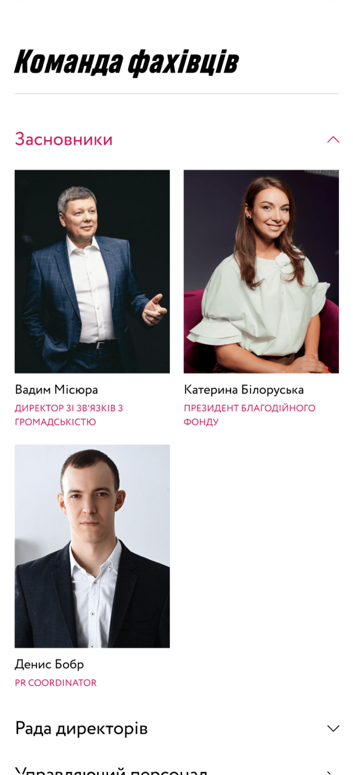
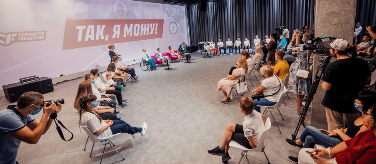
The fund's page provides an opportunity to find information about the fund and to join it. You can find the section in the header, so all events are always available to the user.

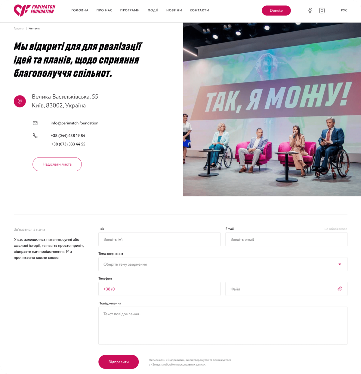
We developed a unique, thoughtful page with the fund's contacts, the page also provides a feedback form.
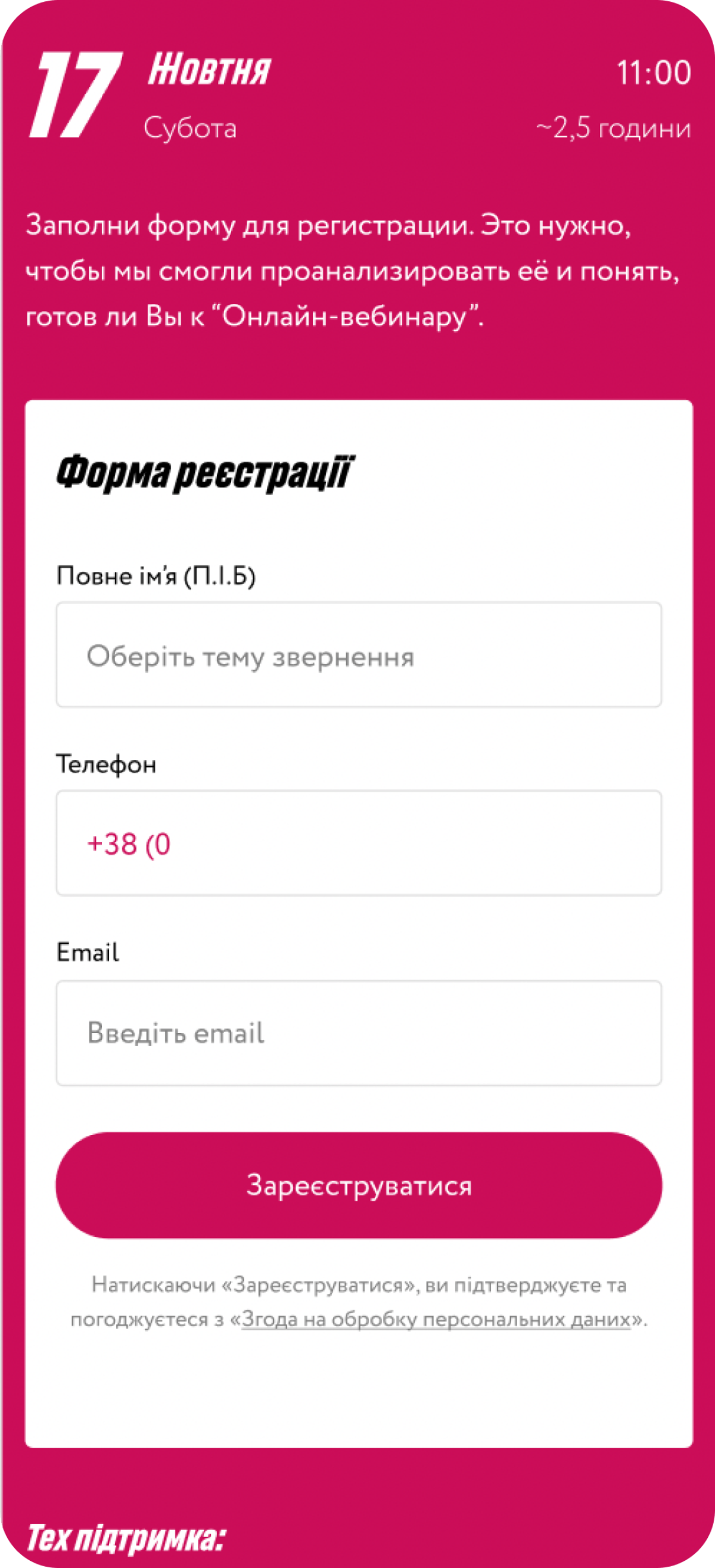
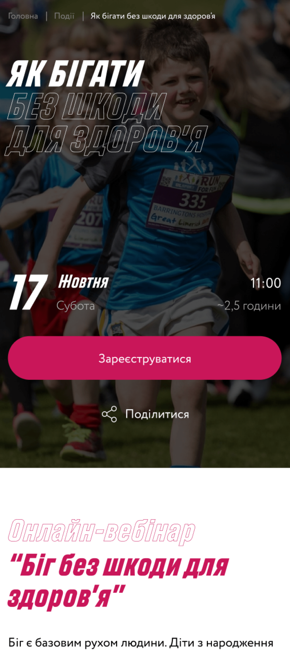
We have developed an event page that includes the date of the event, time, detailed information and the possibility of registration.
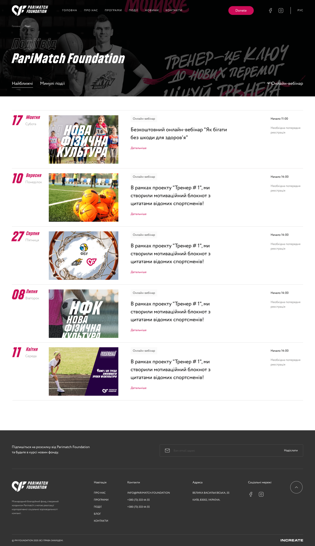
We developed an adaptive version of the site, and the user has the opportunity to familiarize himself with the information even on a small device. All effects and animations are preserved for mobile and tablet devices.
The main goals of creating a corporate style are to identify products and indicate their connection with the foundation.
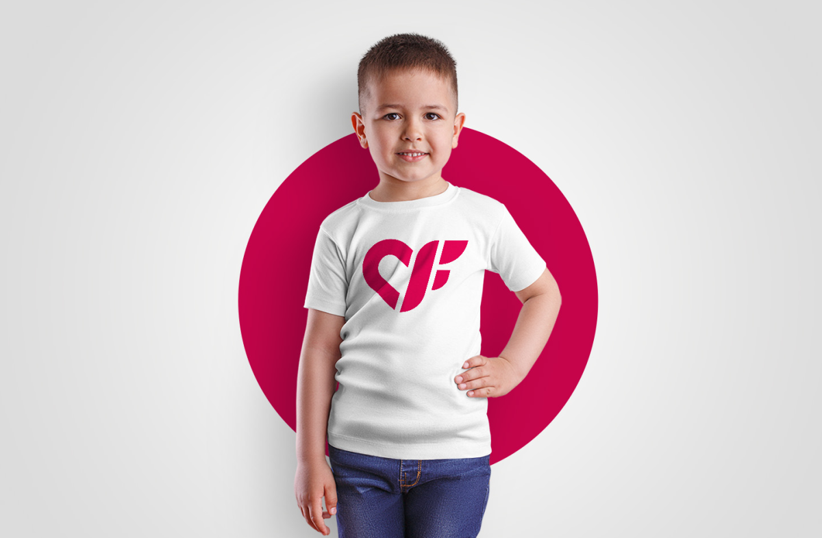
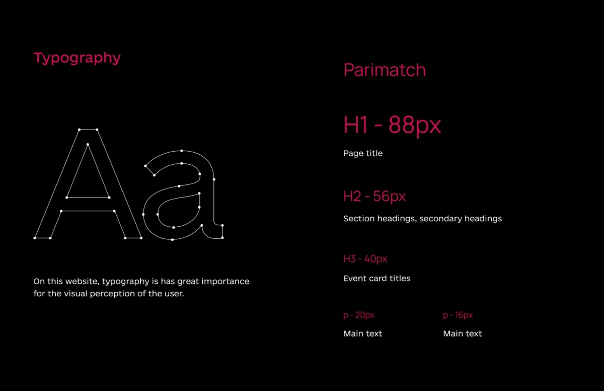
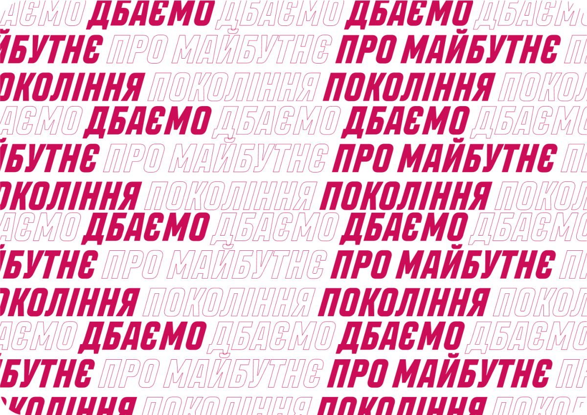
Developed brand color, font, logo and UI kit.
projects
We create craft websites that help unleash their market potential.
Additionally, our work flow provides companies with methods that meets demands for clients.
and let’s go!
Would you like to know the price range and time for creating your project? Give us any information about your idea and get quick feedback.

Your request is accepted.
We got your cool feedback.
